top of page

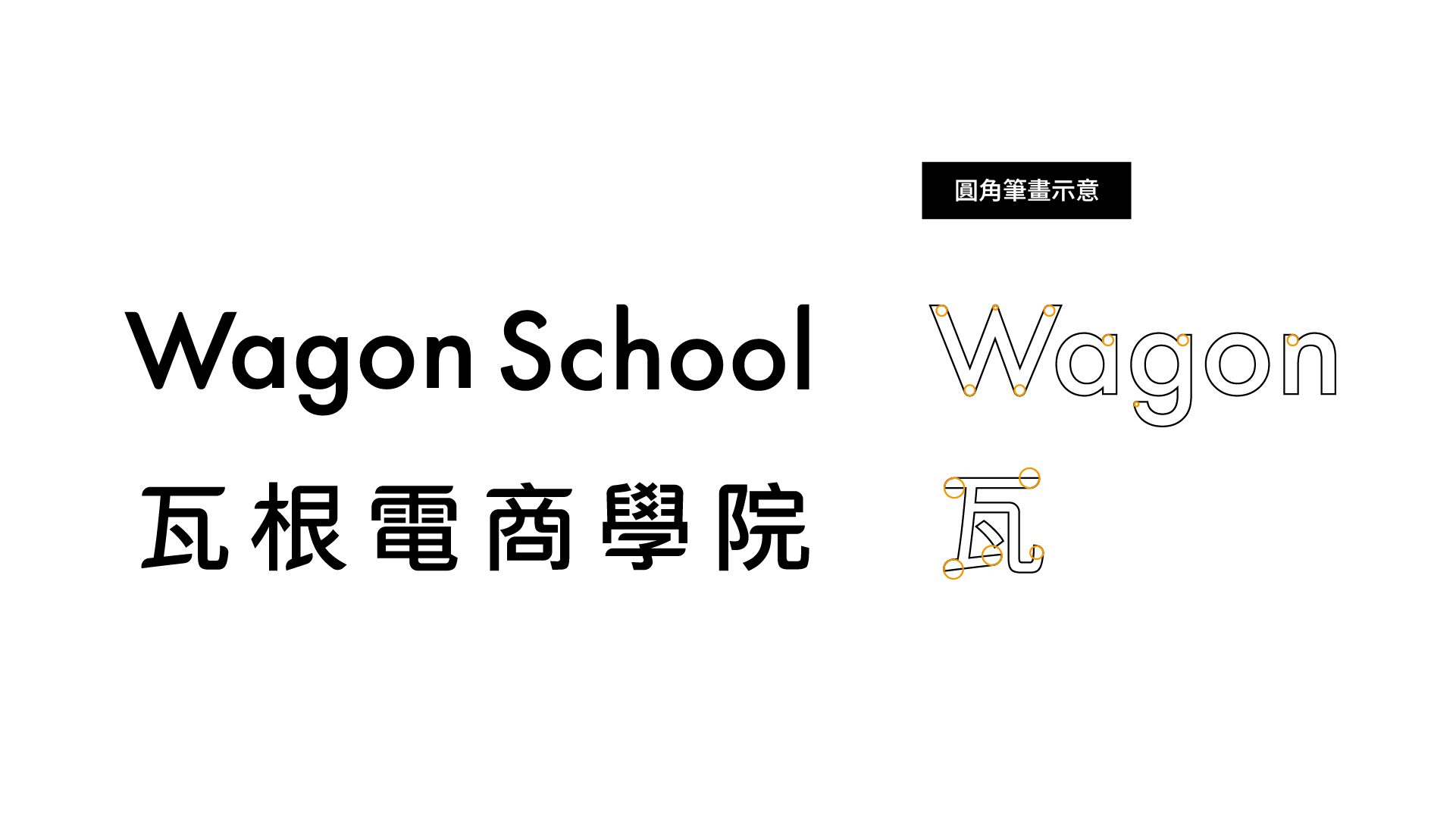
Wagon School

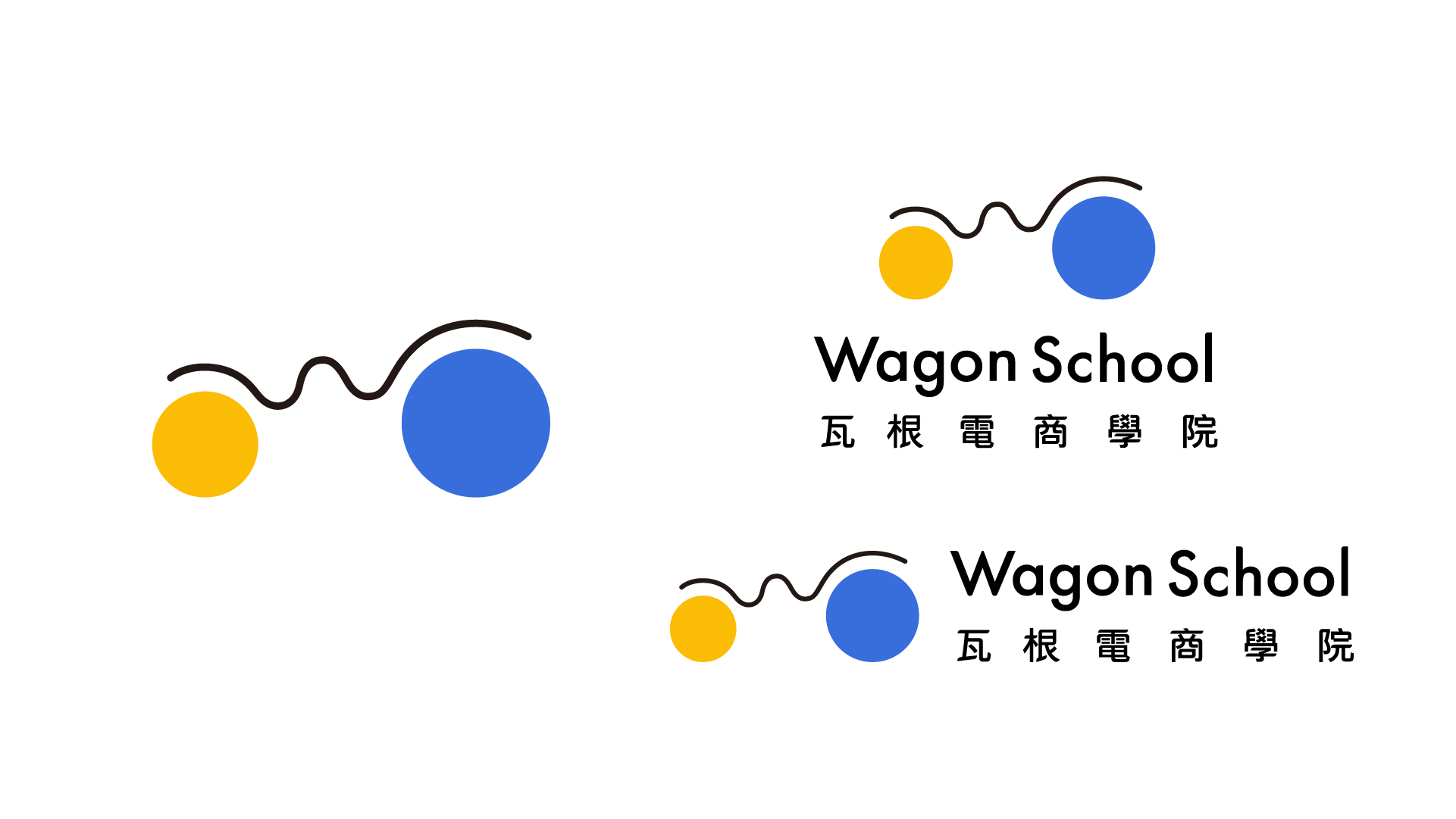
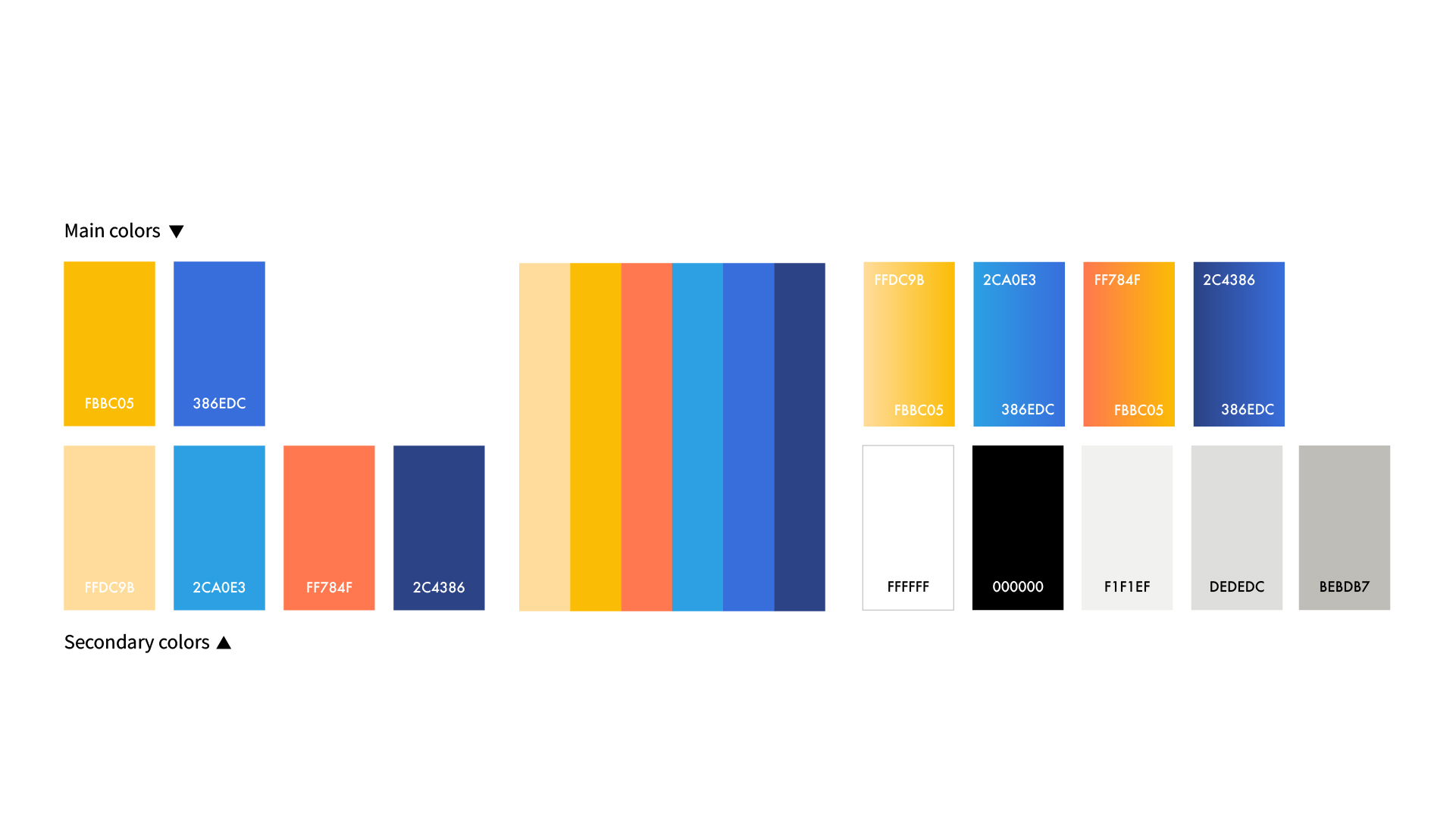
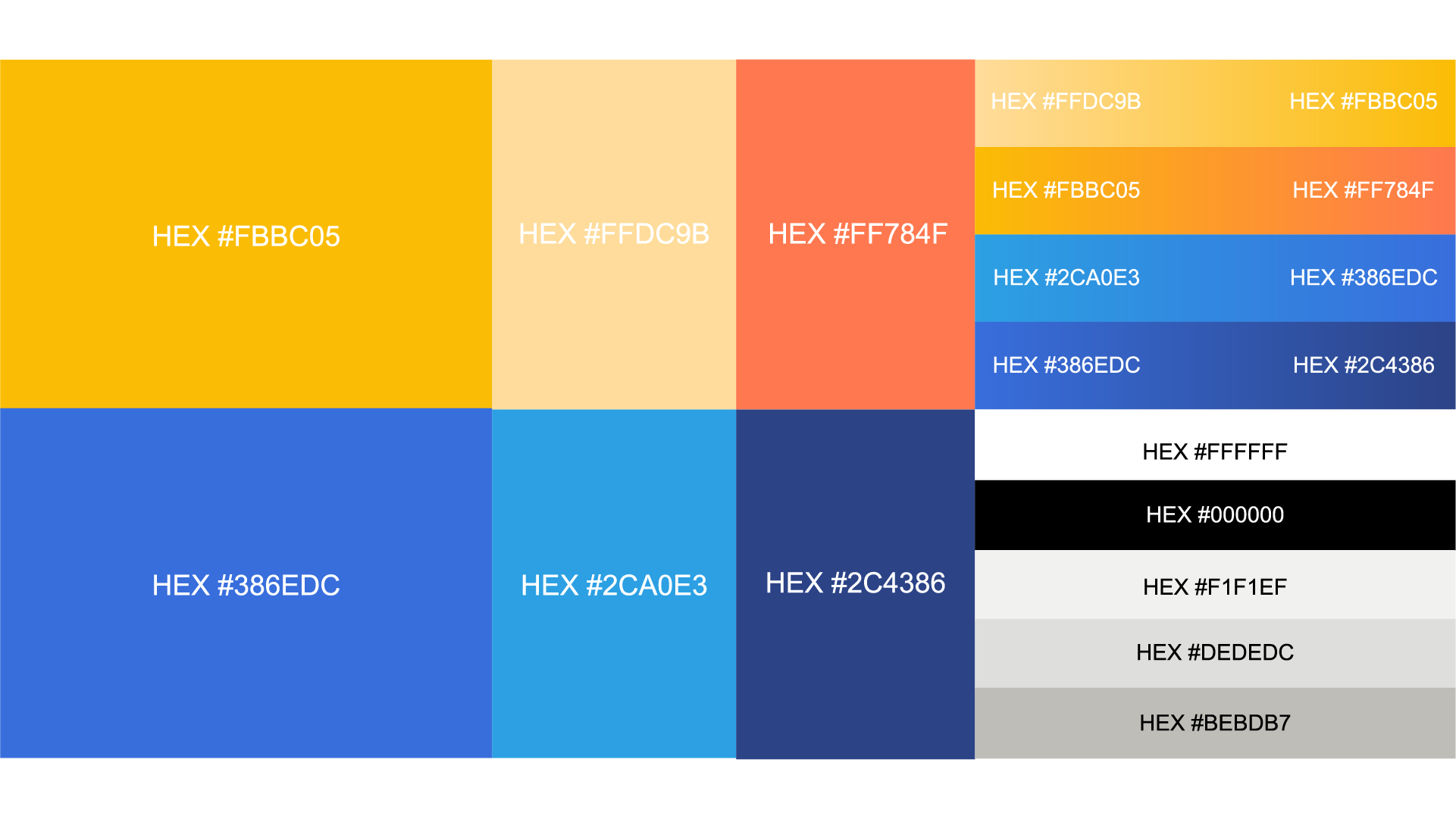
品牌名稱源自「Wagon」,象徵著穩健、前行與承載。在視覺語言上,我們將流線型的「W」與圓形交織出馬車與筆記的輪廓,傳遞出在瞬息萬變的電商浪潮中,持續驅動新知與商業價值的核心精神。色彩計畫以專業穩重的藍色為核心主調,並局部點綴溫暖的黃色與橙色,在傳遞理性專業的同時,也交織出安心、溫暖與社群互動的親切氛圍。
The brand's name originates from "Wagon," symbolizing stability, progress, and capacity. In terms of visual language, we intertwine a streamlined "W" with a circle to outline a wagon and a notebook, conveying the core spirit of continuously driving new knowledge and commercial value amidst ever-changing e-commerce trends. The color palette centers on a professional, steadfast blue, accented locally with warm yellow and orange—balancing a rational, professional image with a comforting, approachable, and engaging community atmosphere.
Gallery
View work details


OTHER WORKS


















bottom of page